test

THE STORIES BEHIND THE EVENTS (or random things we think are cool...)

About Us

My photo
PARTY PLANNERS OF SPECTACULARLY SPECTACULAR EVENTS

Sunday, January 23, 2011

Dessert Fit for a Princess


Since the Royal Wedding is just around the corner, I thought I would publish a post about a wedding we did last year. It was the first time, believe it or not, that we were asked to create a Fairy Tale Wedding for a bride-to-be. She had found her Prince Charming, the castle was booked and now it was up to us to coordinate the details that would bring her dream to life.


One of the first calls I made was to the dashing caterer Rick Rowe, formerly with Daniel et Daniel, and now with Presidential Gourmet. Rick immediately got the vision and hit a home run when he suggested white-glove, cloche service and a Fabergé Egg for each guest, sitting under a cage of spun sugar for dessert.
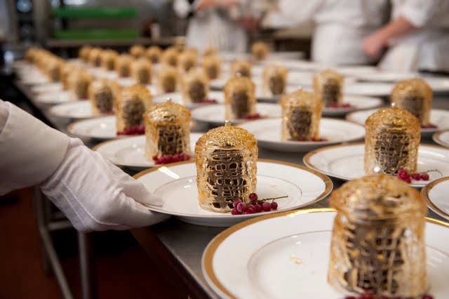


The Egg itself was rich, dark chocolate, molded into a delicate egg form (in two halves to make the whole). These were filled with the lightest dark chocolate mousse and flavoured with a hint of Triple Sec. The spun sugar cage was molded and created in advance of the mousse. An entire week was spent creating the masterpiece, as the timing and order of the multiple steps (sugar cage, chocolate base, chocolate egg mold, mousse, egg decoration, dragées) was key to producing this fragile and beautiful indulgence.


I was so proud of Rick when he wrote to tell me that his creation won a Catie Award (the International Caterers Association), a few months after this magical evening. Working with such creative and professional people in this industry is one of the best parts of my job. I love when I give a colleague a nugget of an idea and then see them run with it -- in this case, Rick soared to new heights. This dessert made guests' mouths drop open when presented to them and went far beyond anything our Fairy Tale Princess ever imagined when she dreamed about her wedding...
Images courtesy of Storey Wilkins Photography

Row, Row, Row Your Boat


We did a blowout wedding last summer in cottage country at a beautiful, lakefront property. Our bride and groom got married on the boathouse deck and as the ceremony was drawing to a close, the massive Wenonah II pulled up at the dock below to whisk all the guests off for a 2-hour cocktail cruise around the lake.


We brainstormed to come up with a fun and creative way to tie this cruise into the rest of the wedding and -voilà- little floating boats became our escort cards for the night. Poor Barb at Fiori had the tedious task of folding close to 150 of these little charmers, but it was worth the effort to see the look of delight on guests' faces as they fished around to find their own names.


Finally, here's a little snippet of video that the wonderful Luis Moreira of Images Film and Video shot for us. It makes me laugh every time I see it:


Thank you to Storey, as always, for the great pictures, Lidia for the amazing decor and Luis for documenting the festivities so fabulously.

Monday, December 20, 2010

Daniela and Marco in WedLuxe Magazine

We are especially proud to have the wedding of Daniela and Marco appear in the pages of WedLuxe Magazine because this particular couple came to us when they fell in love with another wedding we'd organized in that very same magazine! T.H. Jackson Huang of Ikonica, Lidia Tacconelli from Fiori Floral Designs and Julie and Christian from Pantry Press were part of the same team on that original wedding... it was such fun to work with these amazing professionals on something that was rooted in the same colour scheme, but executed in a totally different and modern way.


This time around, the venue was the sophomoric Royal Conservatory of Music. The light, the windows and architecture all work together for guests to experience a place like no other in Toronto.


A small glimpse at the menu that Pantry Press designed, based on Chef Arpi Magyar's culinary offerings. Each menu also worked as a place card, with each guest's name featured at the top.


We custom-designed creamy white lucite containers to hold the floral and candle components for this event. We tried to get the colouring as close as possible to the white Victoria chairs from Contemporary Furniture Rentals!


Finally, a beautiful photo of our fantastically fun couple. Thank you for one of the most entertaining and laughter-filled planning experiences we have ever had. We look forward to years of friendship between us ahead. And, yes, Marco, everyone thought you looked Ridiculously Good Looking on your wedding day...

Friday, December 17, 2010

Daniela and Marco: Some Fun Details

Now that you've seen some of the beautiful room shots, we thought you might enjoy seeing some of the details that didn't make it into the magazine... Because this wedding reception was being held at the Royal Conservatory of Music, we thought we should embrace some of the elements that could be found within the hallowed halls of what is arguably Canada's finest music school.


During cocktail hour, all the hors d'oeuvre were passed by waiters on cymbals. This particular photo shows Couture Cuisine's mouth-watering crispy fried shrimp with a kadaifi crust. Oh my...


This photo cracks me up: it was taken long before the guests arrived... Kristin Campbell, the Facilities Rental Manager snapped this photo of the cymbals going through the dishwasher at the RCM on her iPhone!


Escort cards were slotted in between the strings of three beautiful, ornate harps. The harps were handily situated at the top of the stairs, so they were the first thing the guests saw as they entered the Atrium where the dinner took place.


Finally, a detail that was a small, inside joke for our bride and groom. Pantry Press did up these cheeky signs to go on the back of Daniela and Marco's chairs. The original artwork from the letterpressed invitations was carried through the entire day; from the escort cards, to the menus and beyond...
Ikonica's T.H. Jackson Huang was the natural choice to photograph this wedding. Not only is he a gifted photographer, he spent years of his youth studying and practicing violin at the Royal Conservatory! Thank you, to Jackson and his team for capturing this magical day so beautifully.

Saturday, November 27, 2010

Med School Reunion, 1.0

We were recently asked to help organize a 10th Reunion for the University of Toronto Med School Class of 2000. The dramatic Fermenting Cellar in the Distillery District was chosen to host this very glamourous party... The colour scheme came from the time of year (Fall) and how well orange plays off the linens we chose, a cheeky take on doctors' scrubs...


Orange is my favourite colour and because most brides don't tend to share that sentiment, I love to use it in corporate or other social gatherings whenever I'm allowed. It's such a warm, wonderful hue -- and , most importantly, it flatters all skin types in photographs!


Lidia Tacconelli of Fiori Floral Designs shares my love of the colour and went to town with every orange flower she could get her hands on. The arrangements were bold, bountiful and bursting with personality. At the end of the evening, we arranged to have all the flowers delivered to Princess Margaret Hospital so that even more people got to enjoy the riot of orange.


This is a fun shot down one of the tables... the two metal structures at the end of the table (that those of us in the industry have dubbed The Boobs) were once used in the liquor-making process, right there in that very room, in it's past life as the Fermenting Room for the Gooderham and Worts Company.


Over 100 graduates and their guests gathered for what they referred to as a very "In Style" party. When I heard that, I knew we had done what the Class Organizer had asked of us. In our initial meeting, he requested a truly Spectacular party... one that inspired so much talk, it would ensure all the people who didn't come to this reunion would surely be there for the next!

Med School Reunion, 2.0

As with any great party, it's the details that make all the difference. We thought we'd share some with you here:


This was the booklet we designed to sit at each place. It worked 3-fold: the front (pictured here) showed the "logo" we designed for the reunion, the back listed out the menu for the evening and the inside can be seen in the next photo...


We scanned the yearbook photos from 10 years ago and got each attendee to write in where they were practicing now, what their specialty was and what their favourite med school memory was. We thought this would be a fun memento for people to take home with them to read up on their fellow classmates in the likely event they weren't able to connect with each and every one of them that night.


Here's a shot of the parting gifts: a bottle of "vitamins" for each attendee and a group photo taken earlier in the night. Each photo was in a custom-designed folder, made to look like one in a doctor's office, with a tab at the top with the class name.


Here's a close up of the bottle of "vitamins," a.k.a. chocolate truffles, courtesy of our chocolateer friends at Eitelbach. We had the class rep write out the latin prescription for "take one truffle, three times a day." We then added, "take 3 and call me in 5 years;" their next scheduled class reunion!


And finally, a detail that few probably found as funny as we did: antique medical illustrations on every stall in the bathrooms. A foot here, an aorta there... we thought this would take the former students RIGHT back to their days in the classroom!
A very hearty thank you to Nicole White from Tynan Studio for the photos.

Monday, October 18, 2010

New Website Photos: A Sneak Peek

Embarrassingly, it's been almost 2 years since we've updated the photos on our website. Alas, it isn't for a lack of fabulous weddings, parties or celebrations... it's simply about finding the time to actually make it happen! Our webmaster guru, Todd, is in the process of updating our pictures literally as I type; but it never goes quite as quickly as an Instant-Gratification-Girl like me would like. So in the meantime, I thought you might enjoy a snippet of some of our favourites:


Photo credits:
Photos 1, 3 & 4: Courtesy of Storey Wilkins, Storey Wilkins Photography
Photo 2: Courtesy of Rebecca Palladina, 5ive15ifteen Photo Company

Wednesday, October 6, 2010

Perfectly Pressed

I've been lucky to work with some pretty special vendors over the course of my career and thought it was high time to dedicate a post to two of my favourite people of all: stationers Julie Gibb and Christian Morrison, the husband and wife team that own Pantry Press, purveyors of fine letterpress. For invitations and subsequent menus, programs, place cards etc., you would be hard pressed (pun very much intended) to find anyone better out there. There are many, many examples I could show of their beautiful, handmade work but thought I would highlight some of the pieces they created for Kirsten & Jamie's wedding last March at the Canon Theatre.


Julie created this lovely program for the ceremony: it's a little hard to tell here, but the letterpressed cover with the title, "I Do," was then covered in a layer of glassine that wrapped around the cover, like a book jacket. Julie then took every single program (all 250 of them!) and ran it through her sewing machine so that the spine bound the pages together with a beautiful gold thread.


This is one of my favourite shots that photographer Storey Wilkins captured that day, taken while Kirsten and her bridesmaids were getting ready in the not-so-glamourous basement of the theatre. The ladies had their very own Green Room and each of the bridesmaids had her own makeup station, surrounded by bright lights. It may not have been fancy, but it certainly was authentic down there! This photo was part of the feature on this wedding in the current issue of WedLuxe Magazine.


When guests first arrived at the beautiful Yonge Street entrance of the theatre, the first thing they received were their escort cards. I love the authenticity Julie and Christian were able to achieve, right down to the perfect perforations on the sides. We had real theatre ushers handing these out, from boxes marked A-I, J-R, S-Z! The backs were also printed with the date and place of the wedding.


One of the first things I arranged when we decided to move forward with this unusual wedding venue was to arrange a tour for all the vendors who would be involved so they could see exactly what we were going to do. Julie and Christian turned up armed with a camera and took lots and lots of detail shots, all around the theatre, which ended up on various parts of the stationery created for that day. The inspiration for the menu came from the jaw-droppingly beautiful golden dome in the ceiling of the theatre itself.


And finally the funniest element they created for the day: I had the idea to call Chef Arpi Magyar's late-night take on the Egg McMuffin "The Kirsten McFirsten," (based on the bride's 'married' name of Kirsten Firsten) then Julie and Christian ran with it, going so far as to add: "I'm Lovin' Him... I'm Lovin' Her" to the design. McFabulous!

Julie and Christian are some of the kindest, most thoughtful people you could ever be fortunate to work with. Julie handles the design aspect of the business (though her husband is also a graphic designer -- he would want me to mention that!) and Christian tends to the letterpress; painstakingly running every piece through the press, one element at a time. It certainly isn't a very fast or modern way to make a living, but the artistry and love that they bring to every product they produce is a throwback to a slower, more gracious era. Every time I pick up one of their wonderfully tactile, letterpressed invitations, I am grateful that they are keeping this time-honoured craft alive. Lastly, potential clients, take note: Christian makes a mean latte too!